Vrossis Canada Inc. Merchandise Stand by Vrossis |
Home > |
 |
|
||||
| DESIGN DETAILS | |||||
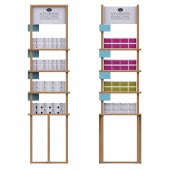
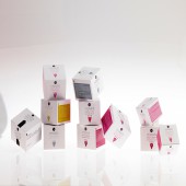
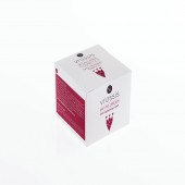
| DESIGN NAME: Vrossis Canada Inc. PRIMARY FUNCTION: Merchandise Stand INSPIRATION: the color came of the color of a healthy skin layer and of course natural colour like white or light brown the natural colour of the earth. in both variations we use the logo of the company which means nourishing in ancient greek and use bright colors to underline each cosmetic series. I.E green colour is for acne/ therapeutic, blue is rehydration series (water) , pink for women, black with austerity for men. UNIQUE PROPERTIES / PROJECT DESCRIPTION: Stimulation of the 5 senses human system are unique in order to promote the quality of the products, as they belong in a special category which is called corneotherapy, means fixing the stratus corneum layer of the skin. Bright colors t are used to attract the audience then the smell , hearing while using airless jar and sensing the cosmetic. Taste is not present that s why we used the ancient greek term vrossis which means edible and nourishing . OPERATION / FLOW / INTERACTION: idea is to to attract consumers attention by using simple and cheap materials they reach their target. The white stand is for pharmacies using the white sterilized color gives the impression of a high quality dermaceutical, while the wooden stand gives that impression and at the same time using pine wood in a warmer sensation makes the product places the product in a top line and makes it at the same time close to the consumer PROJECT DURATION AND LOCATION: project started in march 2016 athens greece and after some sales we finished it on September 2017. Traveling from far east to Canada and from Stockholm to Nairobi in order to get the international marketing trends in the cosmetic industry FITS BEST INTO CATEGORY: Interior Space and Exhibition Design |
PRODUCTION / REALIZATION TECHNOLOGY: There are 2 variations. First variation we use white recycled paper in order for the cosmetics to give a cleanmedical purpose as they actually are. At the same time using bright colors interavt immidiadelly so its primary role is done. The second variation is for health and cosmetic stores so in that case we Veneered particle is used and board as well as in the shelves. For main frame Pine wood planks in order to make it warmer so to make the product on the shelve to be memorized. SPECIFICATIONS / TECHNICAL PROPERTIES: the first variation the white stand from recycled paper dimensions are 600mmX220mmX2000mm Second variation is 450X450X1850mm here many different materials play cause its role is more complicated we use for boxes Veneered particle board, 320X350X100mm, for shelves 320X600X20mm for main frame Pine wood planks 30mmX20mm and finally to give a detail of elegance at the top the logo and mission are put using white gloss acrylic (pvc or plexiglass) 3mm thick. TAGS: nature, cosmetics, vitality, wellbeing, beauty RESEARCH ABSTRACT: project started in march 2016 athens greece and after some sales finished it on September 2017. Traveling from far east to Canada and from Stockholm to Nairobi in order to get the international marketing trends in the cosmetic industry . The white is for pharmacies using the white sterilized color gives the impression of a quality ''clean product'' with effective atributes, while the wooden alternative gives that impression and at the same time using pine wood in a warmer sensation makes the product places the product closer to nature and to the consumer CHALLENGE: The challenge was to make a dermaceutical affordable to simple clientele and at the same time to educate in in the correct use of cosmetics and pass the message that pure and natural products contribute to the general wellness and that reflects to the skin. These are the main reasons of picking this kind of materials in order to make the stands ADDED DATE: 2018-02-28 16:53:01 TEAM MEMBERS (1) : Antonios Tzimpoulas IMAGE CREDITS: main image#: liatsikos konstantinos/antonios tzimpoulas/liatsikos konstantinos( n.d/phd) optional #: liatsikos konstantinos/antonios tzimpoulas/liatsikos konstantinos( n.d/phd) video credits: antonios tzimpoulas ( n.d ,eng, MsC) PATENTS/COPYRIGHTS: copyrights for the logo of the company belong to Mr. Liatsikos konstantinos , 2017 trademark number 245551 |
||||
| Visit the following page to learn more: http://www.vrossis.eu | |||||
| AWARD DETAILS | |
 |
Vrossis Canada Inc. Merchandise Stand by Vrossis is Runner-up for A' Design Award in Packaging Design Category, 2017 - 2018.· Press Members: Login or Register to request an exclusive interview with Vrossis. · Click here to register inorder to view the profile and other works by Vrossis. |
| SOCIAL |
| + Add to Likes / Favorites | Send to My Email | Comment | Testimonials |


