BASE Typeface by Franco Cervi |
Home > Winners > #46029 |
 |
|
||||
| DESIGN DETAILS | |||||
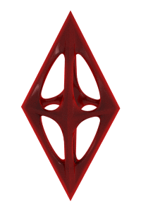
| DESIGN NAME: BASE PRIMARY FUNCTION: Typeface INSPIRATION: In professional terms I have always thought of myself as being on the disciplinary borderline between graphic design and pure art. I have always appreciated the more intellectual, radical and experimental side of graphic design. I'm thinking about the Bauhaus, for starters, and then the art avant-gardes, Kinetic Art, Op Art, Minimal Art and Neo-Geo. One crucial figure for me has been Wim Crouwel, in my view one of the few very great graphic artists of the 1900s. UNIQUE PROPERTIES / PROJECT DESCRIPTION: "Base" is the name of a new typeface conceived and designed by Franco Cervi over a time span from Fall 2011 to Spring 2013. The project is of particular interest because it sums up the original creative vision of Franco Cervi: a minimalist approach, formal rigor and an aptitude for experimentation are the main elements of his graphic research, displayed here as are the associated cultural and formal references, from the graphic design of Wim Crowel to the paintings of the Neo-Geo movement. OPERATION / FLOW / INTERACTION: My research is based on concepts of geometric rigor; I study the mathematical ratios between parts, between full and empty zones, subject and background; I apply rules of Pythagorean geometry, and in this context "Base" represents "the minimum compositional unit" (hence its name), because each letter is generated by the matrix that will then be extended to the whole composition. Base is obviously a "display" character and I believe its best use could be in compositions that view graphic design as an intellectual discipline, rather than a communicative necessity. PROJECT DURATION AND LOCATION: The project started in October 2011 in Milan and finished in October 2013 in Milan and was reviewed by Print Magazine in December 2014. FITS BEST INTO CATEGORY: Graphics, Illustration and Visual Communication Design |
PRODUCTION / REALIZATION TECHNOLOGY: Design sketches represent a fundamental moment in the creative process, because they allow me to build a practically inexhaustible reservoir of ideas, impressions and formal solutions from which to draw at any time. They must first of all be meaningful, i.e. they have to contain a maximum of information regarding the project that is gradually taking form. They are a tool at the service of design and therefore I have never been concerned about their "beauty" in the classic sense of the term. SPECIFICATIONS / TECHNICAL PROPERTIES: Brochure dimensions: Width mm 146 Depth mm 2 Height mm 214 TAGS: Typography, Experimental typography, Minimalism, Minimalist design RESEARCH ABSTRACT: One crucial figure for me has been Wim Crouwel, in my view one of the few very great graphic artists of the 1900s. I have always loved abstract typographical forms, starting with his "New Alphabet" that literally blew me away when I was 20. The "New Alphabet" comes from experimentation on geometric matrices and mathematical ratios, the same kind of research that today more than ever catches my attention, packed with philosophical overtones. CHALLENGE: The fluidity comes from the continuous line that, developing on the matrix, never betrays its fundamental formal premises. This internal consistency has been the main design obstacle and sometimes goes against legibility, but based on the assumptions outlined in my first answer, perfect legibility was never one of the main objectives of the project. ADDED DATE: 2016-02-23 10:34:41 TEAM MEMBERS (1) : IMAGE CREDITS: Franco Cervi, 2015. PATENTS/COPYRIGHTS: Copyright belong to Franco Cervi, 2011/2016 |
||||
| Visit the following page to learn more: http://www.279editions.com | |||||


| CLIENT/STUDIO/BRAND DETAILS | |
 |
NAME: 279 Editions PROFILE: Taken from 279 Editions website: 279 Editions is a publishing company that produces top-quality publications on visual arts and graphic design. We select a meaningful international community of artists and designers to combine their work with excellent design, insightful textual contents and top production standards. Our work is driven by passion, and our vantage point is the pure vision of the artist. |

| AWARD DETAILS | |
 |
Base Typeface by Franco Cervi is Winner in Graphics, Illustration and Visual Communication Design Category, 2015 - 2016.· Press Members: Login or Register to request an exclusive interview with Franco Cervi. · Click here to register inorder to view the profile and other works by Franco Cervi. |
| SOCIAL |
| + Add to Likes / Favorites | Send to My Email | Comment | Testimonials | View Press-Release | Press Kit |