Graffetta Estate wines Logo, packaging identity by Giacomo Stefanelli - Barbara Cesura |
Home > Winners > #46491 |
 |
|
||||
| DESIGN DETAILS | |||||
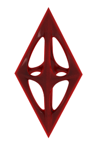
| DESIGN NAME: Graffetta Estate wines PRIMARY FUNCTION: Logo, packaging identity INSPIRATION: In ancient times the Graffetta farmland, located in the splendid southernmost tip of Sicily, was a coral reef immersed in the best of the Mediterranean Sea. From this particular origin, imprinted in the DNA of the land, have been imagined the precious red coral, vibrant with life and sea, meet an inhabitant of the land and the wind, an inhabitant who by her very nature is able to recognise and love something of value: the magpie. A unique encounter, able to break through the barriers of time, have been imagined and then placed on paper to characterize the uniqueness of these wines. UNIQUE PROPERTIES / PROJECT DESCRIPTION: It was needed to espress the quality of the wine, the vineyard and the terroir of the Graffetta Estate, an ancient coral reef, together with the contemporary experience of man to obtain high quality wines. The idea of the agency had been to look for a strong key visual that could easily express the uniqueness and the difference of this special land from the rest. They got the inspiration from the story of the land, an ancient reef, and then found the way to actualize it creating the iconic visual of the magpie, representing the present, that keep in mouth a coral, representing the past. The present recognise the value of its past and they both fly together toward future The icon has been expressed by a specific print technology: the coral has been printed with embossing ink to give body and three-dimensionality while the purpose-designed magpie has been printed in black and white to better emphasise the contrast, the meeting of two worlds. OPERATION / FLOW / INTERACTION: - PROJECT DURATION AND LOCATION: The project started in May 2014 and ended in July 2014 FITS BEST INTO CATEGORY: Packaging Design |
PRODUCTION / REALIZATION TECHNOLOGY: Materic white paper; coloured hot foil for each different variant to express specificty and value; Coral printed in Red 186 plus braille print to give 3d sensation/effect; Magpie printed in Pantone Black U to exalt contrast with coral. Pantone Black U to print text . We used two different Black film to leave separated the magpie and the text so we were able to work on the picture without touching text readability. SPECIFICATIONS / TECHNICAL PROPERTIES: 75cl glass Bordolese wine bottle, shaped larger on shoulder to give more presence and importance TAGS: wine, sicily, Graffetta, Estate, Coral, Italy, packaging, branding, identity RESEARCH ABSTRACT: As per our methodology we worked to look for a concept that could express the difference, the uniqueness of the wine range and/or the terroir and/or the wines. During the study of all the informations we found interesting the fact that the estate in ancient time was a coral reef and now is the terroir of tipical Sicilian grapes. This was really a quite unique characteristic base we used to build a visual concept. CHALLENGE: There was not really a brief. The client needed to give more personality, memorability and character to his range of Sicilian Wines. They previously had a very generic identity but they understood the importance of having a concept and a strong identity. ADDED DATE: 2016-02-25 20:12:30 TEAM MEMBERS (2) : Creative Director: Giacomo Stefanelli and Client Director: Stefano Giuseppe Dell'Orto IMAGE CREDITS: Photos made by Studio Chilesotti Illustrations made by Durante Annalisa and Marina |
||||
| Visit the following page to learn more: http://bit.ly/1M9tDdI | |||||


| CLIENT/STUDIO/BRAND DETAILS | |
 |
NAME: NEOM di Stefano Giuseppe Dell'Orto PROFILE: Neom is a Brand&Packaging design company located in Italy with offices in Verona and Padova. Neom came into being with the precise aim of creating a new venture, as new as those taking part in it feel. In 20 years’ work in the world of high-level branding for the leading Italian and international companies we have been able to consolidate our experience in all the different aspects of Corporate communication and Packaging, specialising in the Food&Beverage, Wine&Spirits, Personal Care, Home Care and Luxury sectors. Neom’s Vision is as simple as it is precise: creating success by communicating with people. The quality of the final result is achieved by maintaining high quality in every single step, from the briefing to the printing. The cooperation of the work team is decisive to reach excellence. Every action, every tool of communication (Corporate, Packaging, POP, ADV, etc.) takes part in the creation of the Vision that is expressed through the brand. |

| AWARD DETAILS | |
 |
Graffetta Estate Wines Logo, Packaging Identity by Giacomo Stefanelli-barbara Cesura is Winner in Packaging Design Category, 2015 - 2016.· Press Members: Login or Register to request an exclusive interview with Giacomo Stefanelli - Barbara Cesura. · Click here to register inorder to view the profile and other works by Giacomo Stefanelli - Barbara Cesura. |
| SOCIAL |
| + Add to Likes / Favorites | Send to My Email | Comment | Testimonials | View Press-Release | Press Kit |